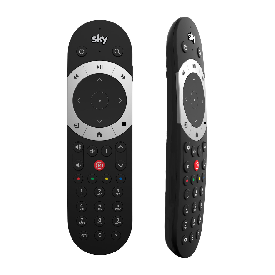
remote redesign

Redesigning the new Sky Q remote control

Changing the interaction for users of a well known product

Why the Sky remote?

I wanted to do a design challenge that wasn’t app or web related but still had a massive impact on the UX of a business and its product.

Hence the redesign of the Sky remote. When starting my UX career, Covid 19 hit the world and the world went into lockdown, and since we couldn’t go anywhere, I went to the TV.

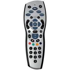
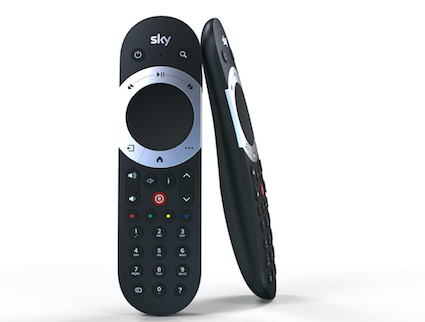
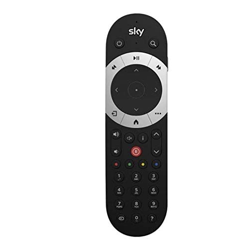
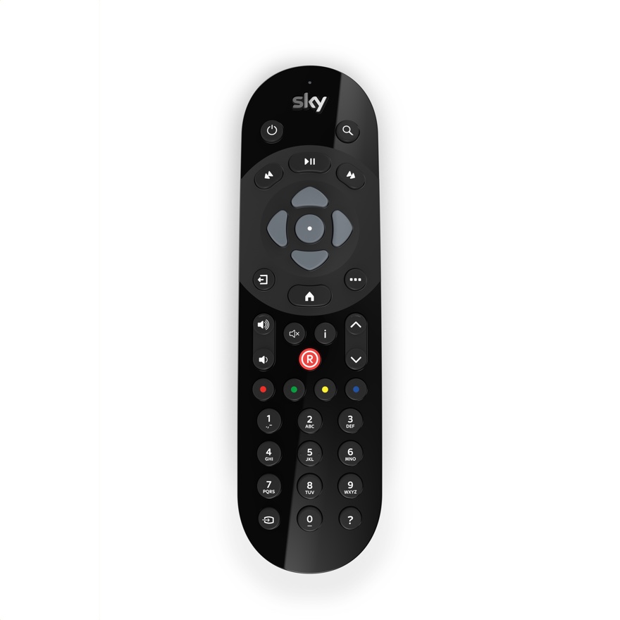
The updated Sky interface had confused me, because in my eyes there was nothing wrong with the old system and remotes. So if not’s broken, why ‘fix’ it? But Sky did change, and they changed everything from the interface on the screen, to the way sky boxes worked in the home and my biggest frustration, the remote.

The History

This is the old design of the Sky remote for the HD boxes. A great design, users knew the remote well and it had pretty much no faults. Everything is clear cut and simple.

When Sky Q was introduced, everything changed. And version one of the new remote was released. But the remote had a lot of user complaints, especially when the touch sensitive bar controlling the rewind feature of the remote. So the designers redesigned the remote. 

And they released version two of the remote along with a ‘non-touch’ version (that looks a lot like the old design of the remote). Users don’t like change and that’s why they prefer the non-touch version.

But they still did not change the problems I faced with the product.

The Problems

The main problems for me when using this product were three things:

  1. The main navigation buttons- Sky has always navigated the channels the same way for a long time. The ‘up’ button navigates the channel to the ‘next’ channel (101 goes to 102 to 103, etc.) But for some reason have changed it, they have switched the navigation on the main buttons so the ‘down’ button now goes from 101 to 102 to 103. It is frustrating to users because they have been used to a system that has been in place for such a long time. But the strangest thing is the quick channel switcher is the same as the old system! 
  2. The ‘stop’ button- On the old system, when watching a recorded program you could just press this button and the program would stop- simple and convenient, but now you have to press back-up a few times. Also when watching rewinded live TV, the stop button would go back to live, but now you have to forward until it is live again. A minor inconvenience but the button is useful. 
  3. The remote is not flat- Unlike the old remotes, the new ones have a sleek finish but they are not flat at the bottom, so when users are trying to press a button on the remote when it is on a table or sofa, you can not press the button. 

The Solution

The solution is simple, I do like some aspects of the new design of the remote so I kept some basics from that. Here is what I changed:

  1. The main navigation is switched back to the old system to match the quick channel switcher
  2. The stop button has been added to the remote
  3. The remote is now flat at the bottom like the old remotes
Back To Top