

HMPO integration
NHS login: Integrating with the Passport office
A piece of work looking into how to make it easier to get your identity verified online
Context
NHS login is a service that is available to everyone living in the UK. In simple terms, it’s a means of having your health information in one place, it also enables you to access your health record, order repeat prescriptions and book GP appointments.
Launched in 2018, NHS login now serves 43 million users. While maintaining a service of this scale for 8 years could become stagnant, our team views it as an ongoing challenge in continuous improvement, balancing high-security health data with an effortless user experience.
The challenge
As this service is dealing with sensitive health information, we ensure to sign people up efficiently and securely. One of our main jobs is to ensure we match the correct people to their NHS record and verify it is them.
We have several ways of verifying people’s identity, some do not even require a verification with photo ID, but the majority need to send photo ID, in order to gain access. They can do this by usually sending a picture of their passport, driving licence or other acceptable identification. This is where a lot of problems can lie.
Firstly, you need access to your ID. In user research, a common finding was that “access to IDs affected the decision of which ID to use for NHS login”. In testing, many people had to retrieve their physical IDs, and they gravitated towards the closest one or the one they could remember about. Many also had photos of their IDs saved onto their devices as they had done online ID verification before for other services.
When people have the ID with them, they then need to take a clear and acceptable picture of it. This means having all of the ID in the frame, no blur or glare on the photo and if necessary making sure to take pictures of both sides of the ID. This can be difficult for many people to do. Many people struggle to take a ‘good, clear photo’ and this could be due to: old phones, smears on camera lenses, lighting, positioning, and people’s ability to hold a phone still enough or see their phone clearly enough.
There’s many barriers for people completing this journey, and our job is to make sure all members of the public are able to do this and make it easier.
The opportunity
An opportunity to integrate with the passport office came along. There was an API available that would be able to directly check whether a UK passport was in their system and within its expiry date. This would avoid many things that delay verification processes in NHS login. Badly taken photos of passports, internal teams verifying the document itself, and people sending in photos of expired passports. All of this costs money and wastes time for the NHS and the staff who handle this information. So it was a ‘win win’ for both the users and the NHS.
We needed to seamlessly embed this integration into the current service. All we needed from users was their passport number to be able to do the check.
Our first design was this:
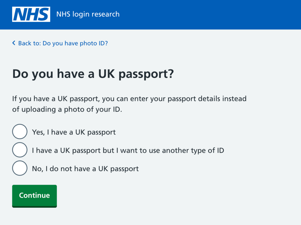
We ask people “Do you have a UK passport?” with the choices of “Yes I have a UK passport”; “I have a UK passport but I want to use another type of ID”; “No I do not have a UK passport”. Our findings from this were interesting. Although all the participants were able to progress, some were left confused as to why they were entering details from their passport.
These participants only read the question in H1, rather than all the content on this page. The question of having a passport was most often answered literally, and worked, but wasn’t thought of as a choice to use the passport as an option. Participants did not realise this would mean using their passport for the ID verification journey.
From research recommendations, we went back to the drawing board and thought about how to rephrase this question so people were informed about what ID they would pick for this journey and why they should pick a passport over any other ID.
This was our second iteration:
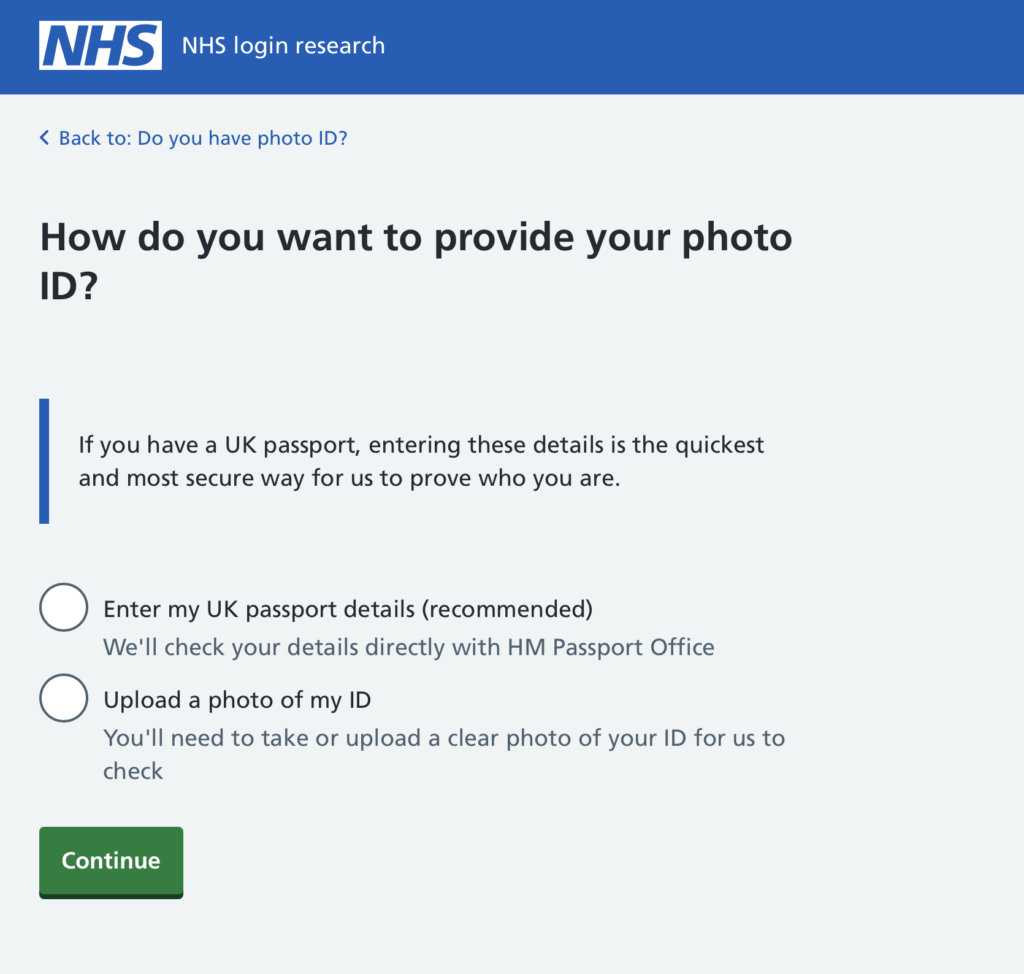
We changed the question to make it more clear that an ID verification journey was going to begin and they needed to make a choice of how they would submit theirs. We tried to make the options clearer by stating the action they would take. Either: “Enter my UK passport details” or “Upload a photo of my ID”. This followed a Home Office design pattern. We also highlighted the benefits of choosing a passport over any other ID because it was ‘quicker and more secure’. This design worked way better than the first.
Participants were making an informed decision about which ID they would use and how they would enter it. We also included ‘recommended’ on the first option, as we wanted to encourage people to take this route as it was more secure and cheaper for the business. Those with UK passports to hand, easily entered their passport number. Those who wanted to take a photo could do so. And those without a passport, were able to use an alternative ID.
However, we encountered a problem with those with foreign passports. In this round, we tested with one person with a South African passport, and they selected the first option of ‘Enter your UK passport details’. They did not notice throughout the journey that they had technically selected the wrong option for their situation. We told them this at the end of the session, they did not realise this at all. They said that they noticed the wording of ‘recommended’ and this is what led them down this route. This behaviour was consistent across participants, “recommended” was actually too powerful (it blinded users to the “UK” qualifier).
From this finding, we wanted to ensure that these pages would work for all types of users. So we went to test these pages through unmoderated testing on UserZoom. We wanted to test with a larger number of people with foreign passports to ensure that they would select the correct option for their situation. In the design itself, we wanted to make sure that the scenario was as realistic as possible and tell users through error messaging exactly why their passport number would not work by reiterating that this journey is only for people with UK passports.
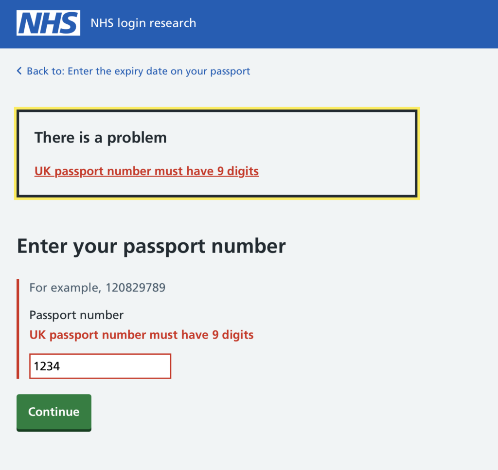
At first, we believed that this design did not test well. It appeared that participants with foreign passports were still selecting the first option of ‘Enter your UK passport details’, even though they had foreign passports. We were confused as to why so many people selected this option.
We then launched another test with a cohort, asking a clarifying question of: ‘Is it clear that this option is only available for people with UK passports?’ in the post test questionnaire. They all said yes. Then led us to investigate this further, why were people choosing this option when they had foreign passports?
We had several theories about this:
- Theory A: Testing bias – Participants pretending to be in a scenario rather than reenacting what they would do in real life
- Theory B: Dual citizenship – Participants had both a foreign passport and a UK passport
- Theory C: Visual skipping – The ‘Recommended’ badge blinded them to the ‘UK’
Launching this with all of these unknowns was not ideal, so we decided to conduct another round of unmoderated testing. This was a lot cheaper than running a round of moderated testing and we could do it fast.
We also iterated the designs again, this time only making small changes based on our key insights. We got rid of the inset content (explaining the benefits of using the HMPO route) and highlighted the ‘UK passport’ part of the radio option. Participants were not absorbing as much information as we would like from the page, most completely skipping this content. We thought that getting rid of this would reduce noise and help people focus on the most important constraint, the ‘UK’ part of the option.
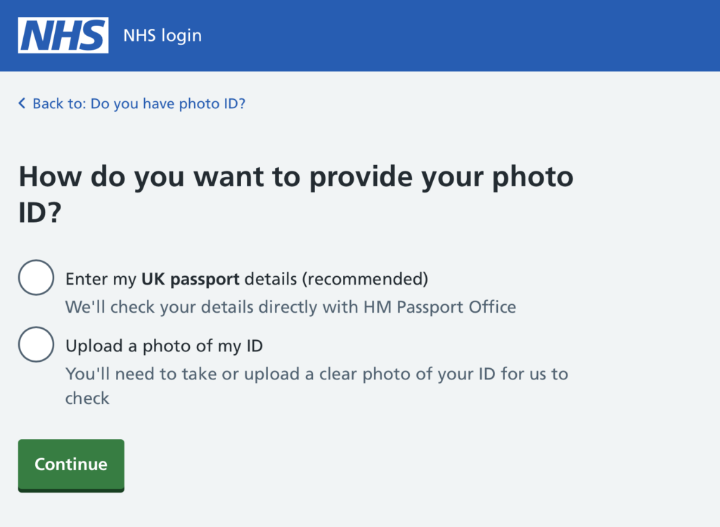
This time, we made sure our screener question could not be interpreted in any other way. We asked the direct question of “Do you have a UK passport?” instead of “Which passport do you hold?”. This question was to filter out those who have two passports or any other possibilities. This screener question seemed to work better. The numbers were a lot more reassuring, although some were still selecting the first option, again our theories came into play.
Given this ambiguity, we had discussions with product, delivery, and stakeholders to evaluate the potential risks of going live against the expected advantages. Ultimately, the team reached a consensus to proceed with the launch, confident that built-in validation would safeguard the process. Specifically, anyone without a valid 9-character passport number would be blocked by error messaging, preventing incorrect submissions.
We are now building this part of the service with this passport number API available for people to use when verifying their identity for NHS login.
From this work:
- Users will only need access to their passport number to get verification, there will be no need to retrieve IDs and take a suitable photo
- It will reduce the waiting time of being given full capabilities and access to their NHS login account
- It will reduce the need for manual checks of pictures through internal staff, saving the business money and the internal staff time
Lessons learned
One of my biggest takeaways from this project was the importance of questioning the “why” behind unmoderated testing data. Initially, the high failure rate in our UserZoom sessions suggested the design was fundamentally broken. However, by digging deeper and investigating participant behaviour, we identified a “simulation bias” where users in a test environment act differently than they would with their own sensitive health data. For future work, I will remember to look beyond the raw numbers. Data tells you what is happening, but only a deep dive into the “why” prevents you from fixing the wrong problem.