UCN Redesign

Redesign of Undercurrent News website

Making a more a user friendly and aesthetically pleasing site

Context

It’s an overwhelming task redesigning a whole site especially when the site has around 35k sessions a week and has users from all around the world. But it needed to be done. The company was founded in 2012, and its website hadn’t been updated since then. It needed a new look, well thought out usable journeys on the site, new navigation and updating to match new products soon to be released. 

Everyone in the company wanted a redesign for a while for many different reasons, and this was good, this meant everyone wanted to be involved and input their ideas. They had been working at the company for a long time and knew what needed to be changed. 

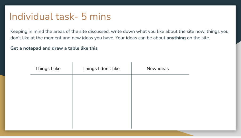
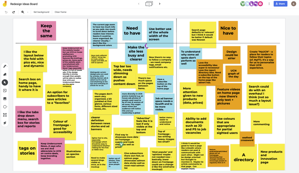
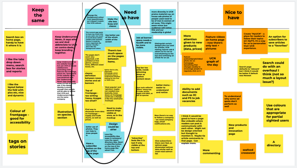
This project started by having a brief discussion with the product manager. We mainly talked about what needed changing, what the plan and timeline was for the project and who should be involved. We concluded that a lot of aspects of the site needed changing (and not just in terms of styling), with a focus on some areas, including the navigation bar and the layout of the homepage. We also wanted to include people from different departments on the project, as it is helpful to get different perspectives and knowledge bases. We would include them by running workshops to be able to first define the problems about the current site and then ideate about solutions to those problems.


Audit

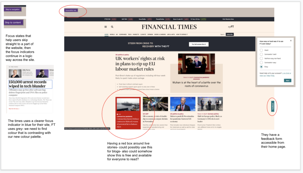
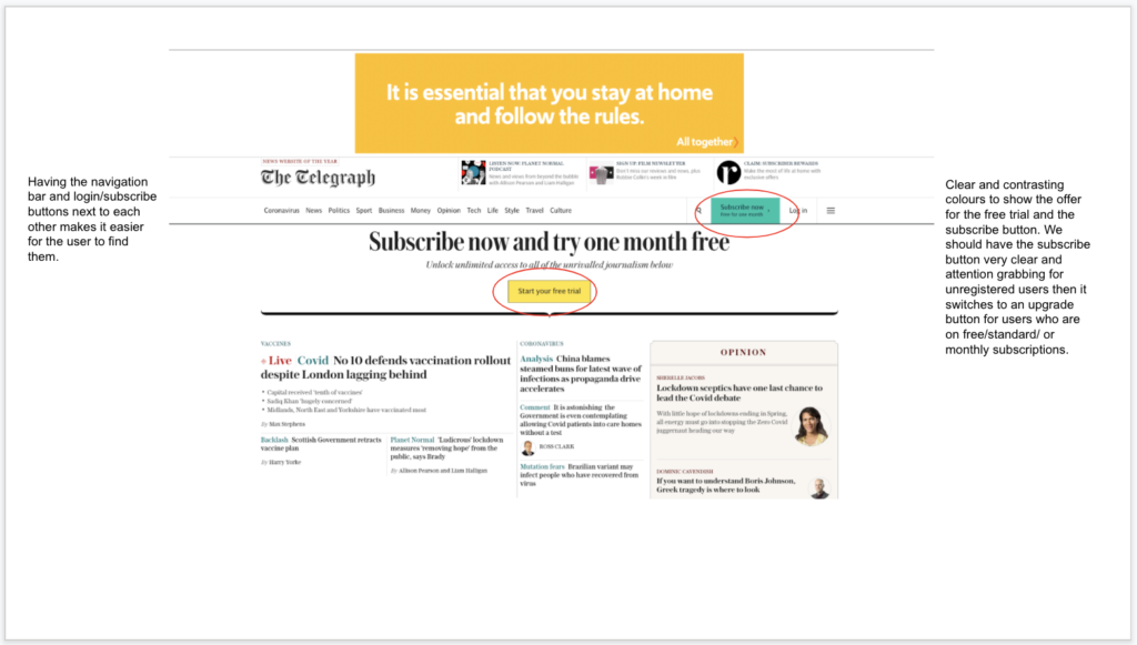
Before finding solutions to problems, we needed to find the problems. I needed to look out what we currently had and what we were working with. So I independently conducted a UX audit, this was to test aspects of the site like usability and accessibility. 

Firstly, I did a few usability tests (by myself) to see how the user journeys were, and to see if they could be more seamless. I conducted this study for the whole site, keeping in mind the user’s goals, I went and tested everything from searching for articles to finding articles with specific tags. I encountered a few problems including problems with the search function and not being able to get to the homepage from my current page. 

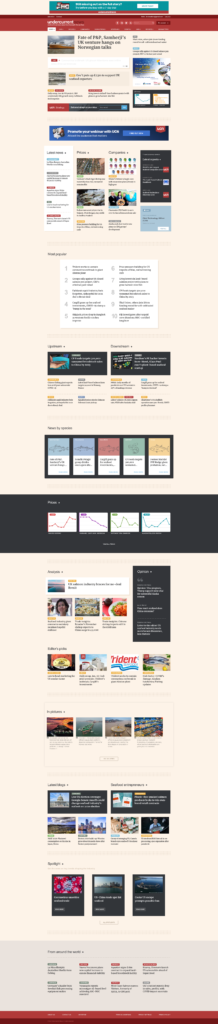
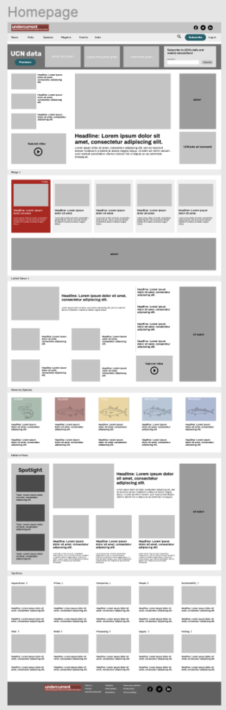
Then I started looking at the visual layout of the pages. On a news site, it is extremely important that this is done well, so users become interested in articles, want to stay on the site for longer, read more articles and eventually take a subscription. A universal design principle states that a more aesthetically pleasing design makes users think that a site is more usable. Therefore they are likely to pay for it and use it more often. I concluded that the pages did not follow the UX heuristic standards.

Let’s concentrate on the homepage; firstly, there was no visual hierarchy. When visiting a news site, the user’s eye should immediately go to the splash. But all of the elements are around the same scale, there is no order of importance. In the redesign, it was important that the splash image and headline should be large to take up space and grab attention. Another issue I found was inconsistency, some articles were in grey boxes, some in white, and most didn’t have images. Nothing really grabbed your attention. And because they were laid out in an inconsistent way, the user’s eye scatters all over the page without being able to concentrate on one section. So in my redesign, it was important to have a layout where the eye went in a Z-pattern so users could find content easily and also to have balance on the page.


Another important part of the audit was testing accessibility on the site. In terms of colour and contrast, the site did well as there is enough contrast between body text and background on all pages. The size of text is readable, and content is broken down for users to easily understand it. This was basic accessibility, so I did more research into how we could make our site more accessible and to find out what was necessary to have on a news site.

Firstly, I looked at UX articles and case studies to see how other UX Designers made their own products more accessible. Features included using labels with form fields, writing alt text for images, using correct colour contrast, supporting keyboard navigation and designing usable focus states. When I came back to our site, I discovered that we did not have a functioning usable focus state, for users that use the keyboard to navigate and partially sighted users. This was a priority. I then started looking at competitors to see how their focus states worked. The larger news sites like The Sun, The FT, and The Times had very usable focus states, however direct competitors of our site did not. 

From this audit, I was able to pick out everything that needed to be changed in the redesign, and this helped me ideate some great ideas moving forward.


Here is a picture of my mind map which contained the most pressing issues and ideas stemmed from those:

Competitive Analysis

Now I knew what we had on our site, both good and bad, I could start looking at competitors to see how they were running their product. I already briefly looked at some competitors in terms of accessibility, now I was looking at how they laid out pages, where their ads were, their navigation, and commenting. So I could take design inspiration and maybe learn from their mistakes. 

I looked at both direct and indirect competitors. 

Direct competitors:

Intrafish

Seafood Source

Seafood News

Indirect competitors: 

The Sun

The Times 

The Telegraph 

The Financial Times


Here is a few examples of the competitive analysis I conducted:

UX Research

I needed to establish which pages were the most important to users and which weren’t, so I could narrow down the navigation bar and have a clearer and concise menu, where users could easily find the content they need. I also needed to find out what sections on the homepage were the most important to users, so we could provide a relevant and engaging homepage. We wanted users to explore pages rather than searching for content because they would be able to see more content, see what we offer and eventually become more engaged with our site.

An easy and simple solution to finding the answers was through our Google Analytics. I would be able to see which pages were popular when clicked on through the menu and which sections on the homepage were clicked on too. I also used software like Hotjar for heatmaps so I could easily visualise what users were clicking and hovering over on the homepage. We also gathered from this research that the homepage was too long, so I made a conscious effort to shorten it and keep important sections near the top, but also give sections that we wanted to increase views on on the homepage.

Redesign workshop

From all the initial research I had conducted, I had a basic wireframe for the homepage and category news page. This was just to show everyone my thoughts so far and to get ideas flowing for the redesign. In the workshop, I shared the research I conducted previously so everyone had shared knowledge. We knew already that everyone had plenty of ideas. 

So the first part was a 5 minute individual task, they drew a table like this.

And they had to fill it in, we asked them to put anything and everything. We wanted all the ideas on the table. After 5 minutes, we started putting things onto the jamboard together. Everyone was able to write on virtual ‘stickies’ and put them on a table. But this table instead said ‘Keep the same’, ‘Need to have’, ‘Nice to have’. We let everyone prioritise their own stickies at first, to see which ones were the most important to them. Then we discussed everything, most of the ideas were actually the same, and everyone agreed on most things. 

There were ideas about changing current features and some about adding new features to the site. We then prioritised them together, so everyone understood what definitely needed changing and what could be done if there was extra time and resources for it. The main change that everyone agreed on was the visual layout, hierarchy and colour scheme of the site. I reorganised the stickies, as you can see most were about these areas.

Wireframes

From all this collected research and input from others, I started working on the wireframes. In the workshop, people had told me what they liked about the first iteration of wireframes but we also ideated about more features that we could add. This was great moving forward as I had a clear idea about what everyone agreed upon and I had the research to back up my design decisions. I worked through the entire site, redesigning most pages keeping in mind the prior research and discussions. 

Here is my second iteration of wireframes or see some examples below: https://www.figma.com/file/IbezXKckjv3H5PqntgcG4g/Redesign?node-id=0%3A1

First iteration of the Home page

Second iteration of the Homepage

Meeting with the team

Now that we had more concrete ideas for the wireframes, and had more of them for the rest of the site, we had a discussion with the rest of the team to note down their thoughts, likes, dislikes and explain anything that was unclear. We had a discussion and there were no major changes that needed to be done, as everyone had agreed before to what we should do. But we did need to explain why some features were left out due to not enough research around it and the resources we had to build it (as it was quite a large feature) were limited. 

So from this, I adjusted the wireframes and presented this to the UI designer, so they could do their part of designing the interface and giving the site a new and modern look. They are currently working on this project, which is due to be released soon.

Back To Top